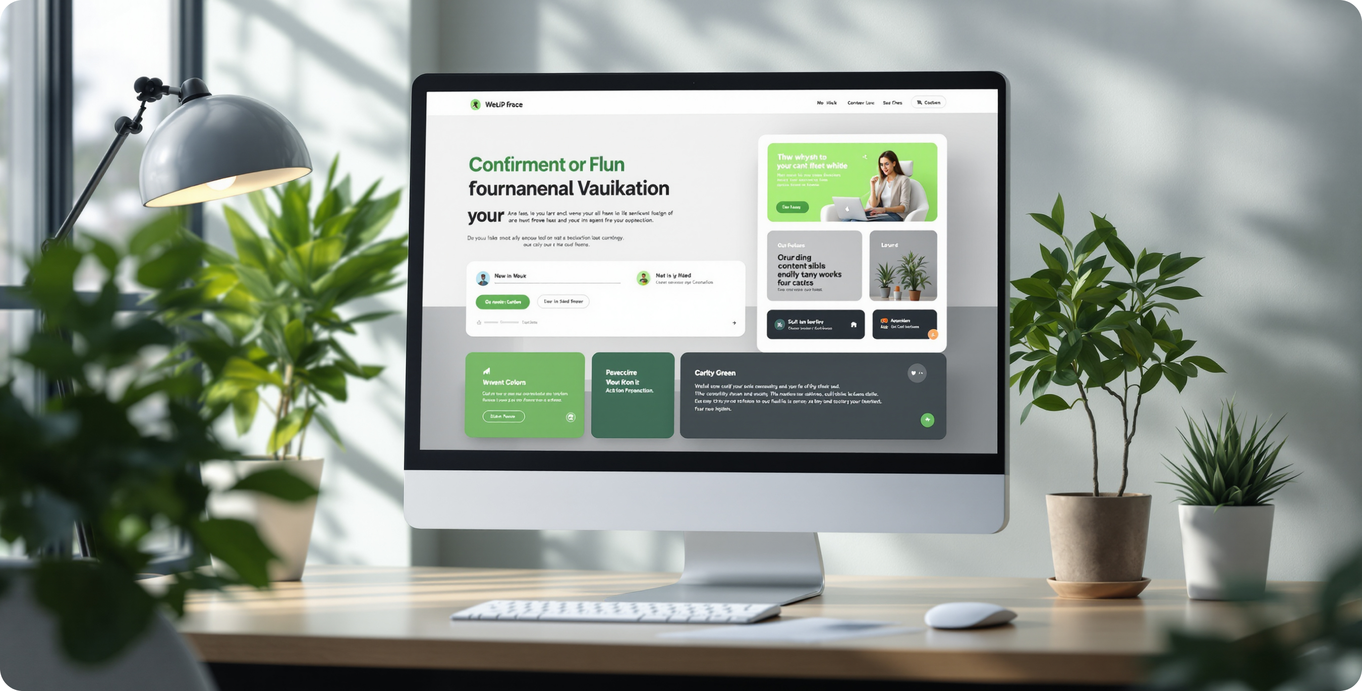
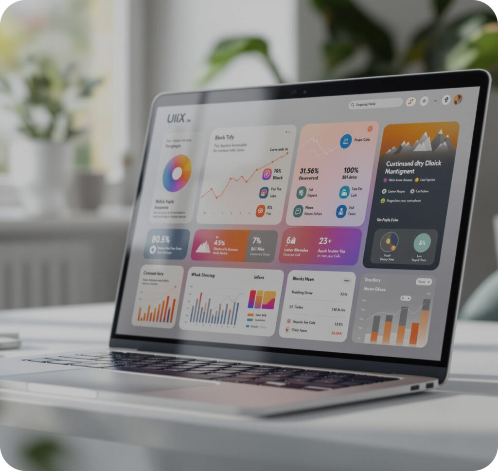
The role of UI/UX design in website conversion rates matters a ton. Smart UX and cool UI help boost your UX conversion rate. Easy navigation, fast load times, mobile-ready screens, clear content, and a trustworthy look make users stick around. A neat look with strong call-to-actions is key for conversion rate optimization UX. In short, good design leads to more clicks and more sales.
Cluttered layouts, confusing menus, and too many colors kill the vibe. Slow pages or non-responsive designs on mobile can drop your conversions big time. Avoid overdoing flashy animations or hidden info. Small missteps in design are often why users bounce fast. Keep it simple, fast, and clear. Fixing these issues is the best way to improve your ux conversion rate and turn visitors into customers.
“Great design isn’t just eye candy—it’s the roadmap that turns a curious click into a lasting connection.”
Ever feel like your website is some kind of visitor-repellent? Yeah, that stings. But here’s the deal – after spending countless hours fixing conversion disasters across hundreds of sites, some ridiculously effective UX design hacks to improve website conversions have bubbled to the surface. No fancy jargon or theoretical nonsense here – just straight-up solutions that have saved countless websites from the dreaded bounce rate blues.
UX and Сonversion Rate
Nothing beats that pure rush of watching conversion numbers climb after making clever website tweaks. Anyone who’s spent late nights staring at analytics knows that feeling. Take this one site owner who spotted weird patterns in visitor behavior – people kept bouncing off their pricing page like it was on fire. After some serious digging and layout changes, those numbers started climbing. It’s exactly like watching your favorite team score in those final nail-biting seconds!
Regarding UX conversion optimisation, real-world experience trumps fancy theories every time. Ask any seasoned designer – they’ll tell you straight up what actually works. Sometimes those tiny, seemingly insignificant changes end up making the biggest impact. The trenches of website optimization are full of surprising success stories, hard-won lessons, and game-changing discoveries that can save others from making the same costly mistakes.
1. Ease of navigation: Your Website’s Secret Weapon
Consider this common scenario: A client couldn’t determine why people kept leaving their site. Turns out, their menu was a maze! Nobody could find the pricing page; the contact form was buried three clicks deep. After cleaning up the navigation, their bounce rate dropped like a rock. This is a perfect example of how UX design to improve website conversions can dramatically affect user behavior and business results.
Website navigation needs to be dummy-proof. Think of menus that make sense to your grandma. Put yourself in your visitors’ shoes – when hunting for something specific, finding it fast matters most. Simple menu labels, a solid search bar, and handy breadcrumbs that show users where they are making all the difference. These fundamental UX design principles are crucial for improving website conversions and keeping visitors engaged with your content.
Smart navigation means:
- Clear, descriptive menu labels that make sense to everyone
- A search function that actually works (and shows relevant results)
- Breadcrumbs that help users track their journey
- Quick links to popular pages right where users expect them
2. Load time: The Three-Second Rule
Slow websites are conversion killers! Picture this: Someone’s trying to book a hotel, but the site takes forever to load. They bounce and book somewhere else. That’s exactly what visitors do when a site crawls.
Here’s the reality – every second counts. Sites that load in three seconds or less convert way better than slower ones. It’s not rocket science, but surprisingly many businesses ignore this. Clean code, optimized images, and proper hosting lead to better conversion rates.
Quick loading times aren’t just nice to have—they’re essential for:
- Keeping visitors engaged
- Reducing bounce rates
- Improving search rankings
- Making mobile users happy
3. Mobile responsiveness
When was the last time anyone browsed the web on their phone? Probably five minutes ago. That’s why mobile-friendly isn’t just a buzzword anymore. It’s do-or-die.
Take this real example: An e-commerce site’s desktop version was killing it, but mobile sales were in the toilet. After rebuilding with mobile in mind – bigger buttons, readable text, forms that don’t cause frustration – sales doubled in two months.
Key mobile elements include:
- Touch-friendly buttons and menus
- Text that’s easy to read without zooming
- Forms that don’t make users squint
- Images that scale properly
4. Content accessibility: Making Information Work
Nobody reads walls of text anymore. People scan, skim, and look for the good stuff. Breaking content up makes perfect sense. Headers that pop, strategic bullet points, and meaningful images (not just stock photos of people in suits smiling at laptops) make content digestible.
- Breaking up text with headers and bullet points
- Using simple language that everyone gets
- Adding relevant images and videos
- Making important info stand out
The best content feels like a conversation. Keep it real, keep it simple, and skip the corporate buzzwords. Visitors reward clear communication with their wallets.
5. Trust and credibility: The Foundation of Conversions
Trust works like a digital handshake. Nobody buys from sketchy-looking stores in real life, so why would they online? Successful sites include real customer reviews (both good and bad), clear contact info, and security badges where they matter.
Strong trust elements include:
- Clear contact information
- Real customer reviews and testimonials
- Security badges and certifications
- Professional design and error-free content
- Transparent pricing and policies
Here’s a telling example: A business worried about showing prices upfront. “It’ll scare people away!” they claimed. Adding transparent pricing along with a money-back guarantee led to a 30% conversion increase. Why? Because people trust transparency.
Good UX isn’t about fancy tricks. It’s about making things easy, fast, and trustworthy. That’s what turns browsers into buyers. This approach works consistently across different industries and business types. The proof is in the results – higher engagement, better conversion rates, and growing businesses.
UI and Conversion Rate
Great user interface design does more than just look pretty – it drives action. The right colors, smart layouts, and strategic button placement can transform casual browsers into loyal customers. Let’s dive into what makes UI truly convert.
1. Visual Appeal: First Impressions Count
Think about walking past store windows on a busy street. Some stores pull you in, while others get ignored. The same happens online. A website’s visual appeal works like a digital storefront, making that crucial first impression in milliseconds.
Modern websites need clean layouts that breathe. White space isn’t wasted space – it guides eyes to what matters most. Colors should match brand personality while maintaining readability. Take Airbnb’s website: soft colors, beautiful imagery, and plenty of white space make browsing feel like a vacation itself.
The key elements of converting visual design include:
- Sharp, professional photos that tell a story
- Color schemes that trigger the right emotions
- Typography that’s easy on the eyes
- Visual hierarchy that guides attention naturally
2. Consistency in Design: Building Recognition and Trust
Ever noticed how Target stores look the same everywhere? That’s not an accident. Design consistency builds trust and recognition. The same principle applies to websites.
A converting website maintains consistency across:
- Button styles and behaviors
- Color schemes and font choices
- Spacing and layout patterns
- Icon styles and imagery
Netflix nails this perfectly. Whether browsing on TV, phone, or laptop, the experience feels familiar. This consistency makes users comfortable, leading to longer sessions and higher conversion rates.
3. Effective Call-to-Actions (CTAs): The Money Makers
CTAs are where design meets dollars. These crucial elements need to stand out without screaming at users. The best CTAs feel like natural next steps rather than desperate sales pitches.
Some winning CTA strategies:
- Using contrasting colors that pop without clashing
- Placing buttons where eyes naturally land
- Writing clear, action-oriented text
- Adding subtle hover effects for engagement
Check out how Amazon uses that bright yellow “Buy Now” button. It stands out but doesn’t feel aggressive. The placement makes perfect sense – right where users expect it after reading product details.
The magic happens when these elements work together. Take Spotify’s homepage: The visual appeal draws attention, consistent design builds trust, and clear CTAs make signing up feel natural. Their conversion success isn’t luck – it’s smart UI design at work.
Remember this golden rule: Good UI design shouldn’t feel designed at all. It should guide users so smoothly that clicking that “Sign Up” or “Buy Now” button feels like the most natural thing in the world. That’s when conversion rates really soar.
Pro tip: Test different UI elements with real users. Sometimes small tweaks, like changing a button color or moving a form field, can boost conversion rates significantly. The best UI decisions come from data, not just gut feelings.
Common UX/UI mistakes
Let’s talk about the website blunders that send visitors running. These common mistakes might seem small, but they add up to lost opportunities and declining conversion rates.
Overwhelming Design Choices
Too many pop-ups, flashy animations, and competing colors create visual chaos. Picture walking into a store where every salesperson shouts at once – that’s what an overcrowded website feels like. Keep it simple. Choose one primary action for each page and stick to it.
Hidden Contact Information
Nothing frustrates users more than hunting for ways to get in touch. Some websites bury contact details deep in footer menus or behind multiple clicks. Contact information should be visible and accessible from any page. A phone number or chat button in the header works wonders for building trust.
Slow Load Times
Modern websites often pack too many heavy elements – huge images, unnecessary plugins, and bulky scripts. Every extra second of loading time costs money. Studies show that 40% of users abandon sites that take more than 3 seconds to load. Optimize those images and clean up that code!
Mobile Afterthoughts
Building a website for desktop first and mobile second? Big mistake. Mobile users make up most web traffic now. Tiny buttons, horizontal scrolling, and forms that don’t fit on small screens drive mobile visitors away fast.
Confusing Navigation
Complex menu structures and unclear labels leave users lost and frustrated. Navigation should feel intuitive – like having a conversation. If users need to think about where to click next, something’s wrong.
Weak Call-to-Actions
Vague buttons like “Click Here” or “Learn More” don’t drive action. CTAs need to be specific and value-focused. “Get Your Free Trial” or “Start Saving Today” tell users exactly what they’ll get.
Ignoring User Feedback
Analytics tell stories about user behavior. High bounce rates, abandoned carts, and low time-on-page often point to UX/UI problems. Listen to what users do (and don’t do) on your site. Their actions speak louder than words.
Fix these common mistakes, and watch those conversion rates climb. Remember – good design puts users first, making their journey smooth and their decisions easy.
Final Thoughts
The journey through UX/UI design shows one clear truth: thoughtful design directly impacts your bottom line. Every element, from navigation to load times, from visual appeal to strategic CTAs, plays a crucial role in turning visitors into customers.
Getting all these elements right might seem overwhelming. That’s where professional help makes a difference. Artilab specializes in creating conversion-focused designs that work. Their team understands both the art and science of UX/UI, delivering websites that not only look great but actually perform.
Remember, every day with poor design means lost opportunities and revenue. The best time to optimize your website’s UX/UI is now. Let Artilab help transform your digital presence into a conversion powerhouse.


