
What makes a good website? Have you ever experienced a situation where interest in a new brand suddenly wanes because its website loads too slowly, has broken links, or has a confusing interface? In today’s world, having an effective and intuitive website is critical to the success of any business. A website serves as a vital component of a digital marketing strategy.
In short, an effective website should be beautiful and highly functional. It is crucial that the site provides easy browsing for a diverse audience, is technically perfect, and has a high level of security.
Suppose you’re in the process of developing your website or looking for the best ways how to do it. In that case, this article will provide valuable tips and tricks to create an effective website that will attract customers and increase your brand awareness.
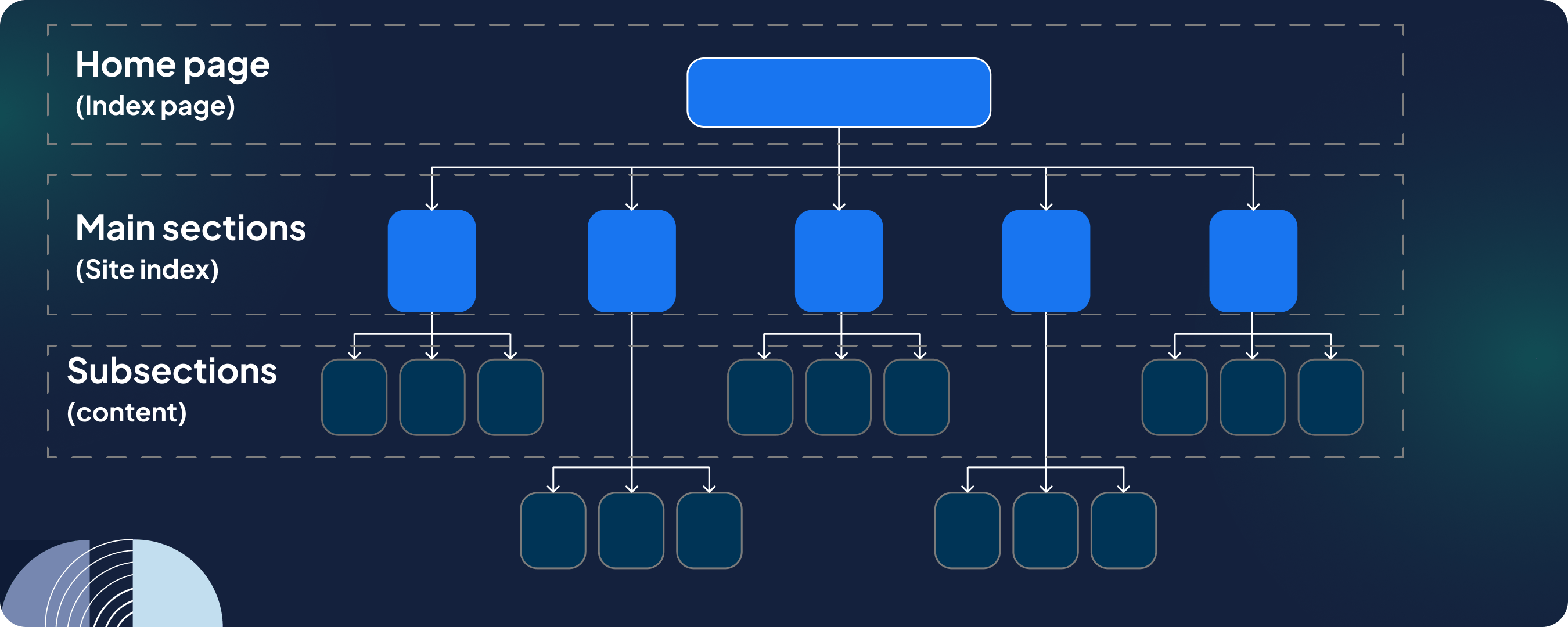
The website has to be easy to navigate
Developing an easy-to-navigate website requires careful planning and including a few key elements. These elements ensure a fluid and intuitive user experience, guiding users to the information they seek without confusion or frustration. The critical components of a website designed to be easy to navigate are
- Clear and consistent menu structure. Navigation menus should be organized logically and hierarchically and be easy to find and use. Consistency between pages ensures that users always know how to navigate the site.

- Search functionality. A visible search bar is essential for content-rich sites, allowing users to find specific content quickly.

- Breadcrumb navigation. Breadcrumbs provide a path from the home page to the current page, helping users understand their location on the site and navigate to previously viewed pages.
- Clear categories. Group content into clear categories so users can quickly find the necessary information.
- Clickable logo. A common trick is to make the site logo clickable and link it to the homepage so users can easily change it.
- Header and footer navigation. Add links to important pages like contact information, FAQs, and social media profiles. This is secondary navigation for users exploring the bottom of the page.

- Responsive design. The majority of web traffic comes from mobile devices. Responsive design improves navigation on smartphones and tablets by adjusting the layout to fit different screen sizes.
- Call-to-action (CTA) buttons. Strategically placed CTA buttons guide users to the desired action, such as registration, inquiry, or purchase.
- Visual hierarchy. Design elements such as color, contrast, and size highlight key navigation options and effectively direct user attention.
- Simple content. Navigation titles and content should be simple and concise, avoiding jargon and overly complex terms that confuse users.
- Accessibility features. Ensure that navigation is accessible to all users, including users with disabilities, following web accessibility guidelines (e.g., keyboard, navigation, and screen reader compatibility).
The importance of visual appeal and user-friendly design
It is worth emphasizing that the attitude to website design is subjective. But, within seconds of visiting a website, users form an opinion about it, and their first impression is shaped by its visual design. A visually appealing website can encourage trust, demonstrate brand values, and set the tone for the user experience. In addition to choosing the right colors, fonts, and layout, you’re responsible for communication that resonates with your audience and creates brand awareness.
However, good design is about more than aesthetics. A user-friendly website design makes it easy for visitors to navigate, find what they want, and complete their intended actions with minimal effort. This includes creating a logical structure, using clear and concise content, and ensuring the site is accessible to all users, including people with disabilities.

Key UX Principles for Effective Website Design
Adaptability. A website must work flawlessly across all platforms and screen sizes in today’s multi-device world. Responsive design ensures that the layout and content of a website can quickly adapt to different devices, from desktop computers to smartphones. This adaptability improves the user experience by ensuring consistency and preventing frustration with pinching, zooming, and horizontal scrolling.
Intuitive navigation. Navigation should be simple and predictable. Users shouldn’t have to guess where to click next or how to find a particular site section. Good UX uses a well-organized structure with a logical hierarchy and clear, descriptive labels. Features such as sticky headings, breadcrumbs, and categorized menus help with easy navigation, making the user’s journey smooth and enjoyable.
Consistency and recognizability. Consistent design throughout the website provides a cohesive and predictable experience for users. This includes consistently using colors, font styles, button shapes, and layout templates. Familiarity is also crucial; adherence to web conventions and standards reduces learning curves for new visitors by making the website more intuitive.
Pay attention to website technical performance and SEO
In digital marketing and the internet, website performance and search engine optimization are vital determinants of site visibility, usability, and overall success. Technical performance and SEO work hand in hand to deliver a superior user experience while increasing a site’s ranking on search engine results pages. Understanding and optimizing these elements can significantly impact website performance, engagement, and conversion rates.
Website Speed
Today, speed is of the essence. A slow-loading website can significantly deter visitors, increasing bounce rates and reducing engagement. Users expect web pages to load quickly; even a few seconds’ delay can lead to frustration and abandonment. Website speed is crucial for user satisfaction and plays a significant role in SEO. Search engines, notably Google, prioritize fast-loading websites in their rankings, recognizing speed as an indicator of a site’s quality and reliability.
Mobile-Friendliness
Mobile-friendliness has become a critical aspect of website design and performance with the increasing prevalence of smartphones and tablets. A mobile-friendly website ensures users have a positive browsing experience on their devices, with readable text, accessible navigation, and responsive design that adjusts to various screen sizes. Like website speed, mobile-friendliness is also a ranking factor for search engines. Websites optimized for mobile devices are more likely to rank higher in SERPs, reaching a wider audience and driving more traffic.
Technical SEO Optimization
Technical SEO is optimizing a website’s infrastructure and underlying code to improve its visibility and ranking in search engines. This includes a range of practices, from structuring data and optimizing meta tags to ensuring clean, crawlable code and implementing secure protocols like HTTPS. Technical SEO makes it easier for search engines to crawl, index, and understand a website’s content, enhancing its visibility and ranking prospects.
Key aspects of technical SEO include:
- Site structure and navigation. A well-organized website with straightforward navigation helps search engines understand the hierarchy and relevance of content, improving indexing and user experience.
- Meta tags and titles. Using meta tags, including title tags and meta descriptions, can improve search engine click-through rates and relevancy signals.
- Schema markup. Implementing schema markup helps search engines understand the context of content, enabling rich snippets and enhanced search results that can improve visibility and click-through rates.
Tips for Optimizing Website Performance and SEO
- Monitor and improve page speed. Use tools like Google’s PageSpeed Insights to analyze and optimize loading times. Minimize file sizes, reduce server response times, and leverage browser caching to improve speed.
- Ensure mobile optimization. Implement responsive design and test your website on various devices and screen sizes to ensure a seamless mobile user experience.
- Audit and optimize your website’s SEO. Regularly audit your website for SEO issues using tools like Google Search Console or SEMrush. Address technical problems such as broken links, duplicate content, and improper redirects.
- Optimize content and keywords. Ensure your content is relevant, valuable, and optimized for target keywords without overstuffing. Quality content improves user engagement and search rankings.
- Secure your website. Implement HTTPS to secure your site and build trust with users and search engines.

Quality and relevance of content
The success of a website depends on the quality, interest, and relevance of its content. Quality content attracts and retains an audience and makes a website an authority. Content connects a website’s goals with its target audience and ensures visitors find what they seek and remain interested. Quality content is the presentation of information concisely and engagingly. Quality content is well-researched, error-free, and consistently reflects your brand’s voice on every page. This content differentiates between visitors staying on your website, absorbing your message, or visiting a competitor’s site.
The relevance of your content is equally important. Content should meet the needs and interests of your target audience. It should address their pain points, answer their questions, and offer solutions. Matching content to audience expectations improves the user experience and boosts the site’s search engine rankings. Google and other search engines prefer content that is not only high quality but also meets user intent.
Therefore, creating content that meets these criteria requires a deep understanding of your target audience. Use analytics and feedback to learn about your audience’s attributes, preferences, and behaviors. Create buyer personas and map their journeys to identify the types of content that will be most useful at different stages. Update your content regularly to keep it fresh and relevant to your audience’s changing needs.
Final Thoughts
So, a good website in 2025 goes beyond aesthetics and functionality. It combines a clear purpose, easy navigation, engaging content, great design, and flawless technical performance. As we’ve already explored, these elements are essential for creating a website that attracts visitors and turns them into loyal customers and brand advocates. At Artilab, we believe that understanding your audience, aligning with your brand goals, and following these core principles are fundamental to creating websites that stand out in the digital age. Remember that the key to online success is to stay on top of things and adapt to the ever-changing web design and development landscape. Let your website be more than just a tool; make it a vibrant, dynamic portal that reflects the essence of your brand and meets the needs of your users. If you need a flawless website that will be a good helper for your business, contact Artilab and we will be happy to develop a website that will sell.